 It’s essential for your business to have a website, but if you’re making these mistakes, you might be hurting your business more than helping.
Visual Mistakes
You can drive people away from your website in a nanosecond with:
- Flash or animation that begins to play automatically
- An extremely busy design
- A very dull, vanilla design
- Tiny text that is hard to read
- Missing, hard-to-find, or hard-to-read contact info
Video/Audio Faux Pas
It’s a great idea to have videos on your site, and if you’re in the music business*, it’s a great idea to have music on your site. But don’t ever have sound begin playing automatically. Users should have to click on a “play” button and choose to play the media on your site.
* If you’re not in the music business in some way, don’t have music on your site.
Essential Information Missing
People are coming to your website to find something. Does your website include these basics?
- Contact information – on every page
- Map (if you have a brick-and-mortar office/store)
- Details about the services/products you sell
- Hours of Operation
- Methods of Payment you accept
- Licenses, certifications, accreditations
- Reviews, testimonials, case studies
- Photos (of your business, your staff, your products, your service vehicles, before and after projects, etc.)
- Frequently Asked Questions
Freshness and Timeliness of Content
Have you updated anything on your website since it was built? Does the copyright still say 2006?
The search engines track exactly when content is published online and they track any changes/updates. If you never add new content or update existing content, you risk being ignored by the search engines in favor of sites that deliver fresh content on a regular basis.
The easiest way to keep fresh content showing up on your website is to add a blog. A blog also gives users the ability to interact with you by commenting or asking questions.
Easy to Use – Or Not
Have a teenager visit your website and watch what they do. If they can’t find important information, or they don’t know what to do next and can’t explain to you what your company does, then you know you have a problem.
Repeat that user test with your mother.
Call to Action or Closing the Door?
What is it that you want a visitor to your website to do? Call you? Visit your store? Buy something online? Book an appointment? Fill out a contact form? Download a file? Leave a review? Print a coupon?
Part of your user testing of your website should be to determine if people can immediately identify what it is you want them to do. If it’s not clear, or there are too many (or too few) choices for a user, chances are they’ll just move on to another website.
Your Site is Buried in the Search Engines
Have you ever searched for your own website in the search engines? Your website should be the number one search result when you type in your business name and city. If it’s not, that’s your first indication that you have a problem.
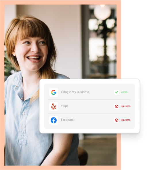
In addition, if you have a physical location or a defined service area, your business should show up in the map results.
And if you search for your specific service/type of business plus your geo-location, your website should show up. If prospective customers can’t find your website, it’s not benefiting you.
Not Mobile Friendly
If you think your customers and prospects are only searching for you on their full-size computers, you are mistaken. More and more people are searching for businesses using a mobile device. And if your website is not truly mobilized, you’re driving away customers.
Full Disclosure
From time to time we republish posts that are still relevant and popular. This blog post originally appeared on May 13, 2013 under the title “8 Ways Your Website Can Hurt Your Business”.


